Moodboard Monday
One of my favourite research methods is the making of a moodboard. Creative practitioners in all fields draw inspiration by casting a wide net. It is through the multi-layered references that something interesting and original can emerge.
I decided to share some of my inspirations with you here - and through it we can trace the evolution of an idea from conception to completion.
The task was simple, create lookbook images that embody the sense of a particular designer. I won't share who the designer was until the project is published but I will share the research process that went into creative directing this particular lookbook.
One of the best pieces of advice I received is to bypass the predictable, (re: first google result) when researching. Instead look at the artists your artist has been inspired by.
I started my research by exploring the much debated link between Art & Fashion and the Arte Povera movement.
Arte Povera
ˌɑːteɪ ˈpɒvərə/
noun
an artistic movement that originated in Italy in the 1960s, combining aspects of conceptual, minimalist, and performance art, and making use of worthless or common materials such as earth or newspaper, in the hope of subverting the commercialization of art.
Early Days
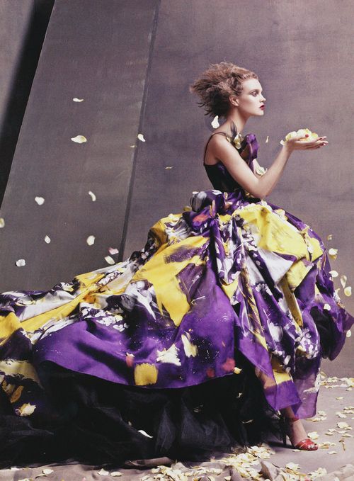
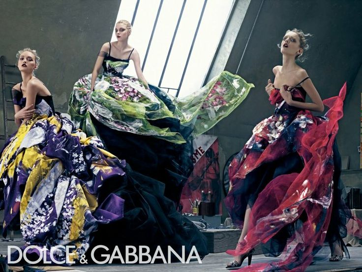
Dolce & Gabbana S/S 2008 ad
One of my earliest memories of Fashion & Art was this collection by Dolce & Gabbana.
The idea of an abstract painted evening gown of tulle and silk may seem like a literal interpretation of "Fashion & Art" but for me it means much more. The 2008 collection as a whole, inspired me to break free of the mold of only using "store bought" fabrics in my early design work. After seeing this collection with it's mixes of tulle and mesh, velvet carpet bags and muslin skirts - I began cutting up and appliqueing old bits of fabric & sheets and experimenting with different dye and paint techniques. Before that I would spend hours walking into various fabric shops and describing a print that only existed in my head.
It was then that I realized top designers and creators weren't heading to fabric shops for the latest collections - they were creating the prints themselves.
The painterly style used here - a nod to kindergarten or outsider abstract art - is one that still informs my practice. The beauty of spontaneous brushstrokes is that they are open to each individual viewers interpretation.
Working Large
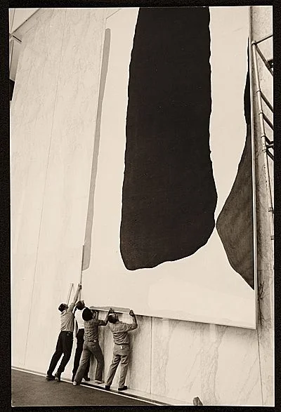
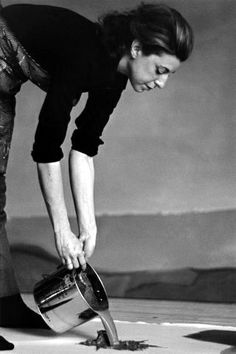
Helen Frankenthaler's studio 1967
The concept of creating my own fabrics and textiles led me to study Textile Design & Fibre arts in 2011. In my third year I laid down the largest piece of linen I could find and spent an afternoon using the largest silk screens I had to create an abstract piece. My plan was to chop it up when finished and make it into 3 small wall hangings - that was until one of my instructors came along and said,
''Working this large is a skill not everyone has. You mustn't cut this up - it deserves to be seen in its entirety."
Helen Frankentahler in her studio, 1966
I heeded her words, rolled the linen up and brought it home. My mom knew the perfect place for it - and my dad set to work attaching three giant canvases together and stretching the linen over top. The piece hangs in my parents living room to this day, and it's only upon closer inspection that you realize it is actually a textile print on linen and not a multilayered painted canvas.
I absolutely love this image of Helen pouring paint directly from the can. A bold move that for the untrained would surely end in disaster.
“There are no rules. That is how art is born, how breakthroughs happen. Go against the rules or ignore the rules. That is what invention is about.”
- Helen Frankenthaler
Scale
An interesting approach to solving even the trickiest of briefs.
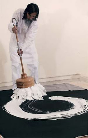
scale.
by using a handmade brush of an enormous scale - Kazuaki is able to create an original work which challenges the viewer to consider new shapes and proportions. Upon further research I discovered the pieces by Kazuaki were all created in a single stroke - in a single setting.
“Tanahashi’s one-stroke paintings ... always painted in just one breath, leave a passionate swash whispered trace.”
– Kyoto Journal.
I found this intriguing as it also spoke to the need for creativity + immediacy which is often necessary when working in the creative fields. It takes a certain skill and bravery to work on such a large-scale (the mistakes could be that much bigger and costly). Working in the style of Kazuaki , forces us to be bold in our choices and to create without looking back.
This style could easily be applied to interior design, fashion, sketches, doodles and blogging.
imagine having only one setting and a fixed amount of time to write your next post or complete an illustration - when the timer is up, or when your pens lifts off the paper, you have to stop! If you're only as good as your latest post or recent collection - imagine what having this added challenge would do to your process...
Ethos
It seems the simplest ideas the most effective on a shoe string budget.
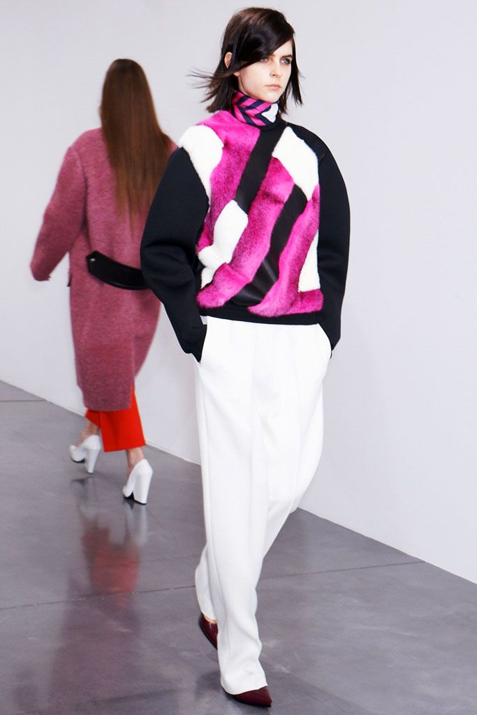
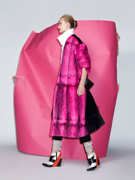
here a piece of pink kraft paper has been outstretched to create a backdrop for a fashion editorial.
matching the shade of pink with the Celine fur, they've managed to create a simple yet striking image, on a plain white studio backdrop which embodies the Celine brands ethos.
simple shapes + structures, in a shocking colour or fabrication for the modern woman.
Rare meets common.
a $5,000 fuschia mink on a $10 piece of paper... Arte Povera.
Art-teacher chic.
Putting it all together
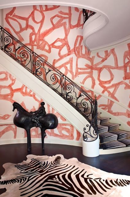
A Kelly Wearstler interior
My research, led me to another source of constant inspiration.
Kelly Wearstler. fearless in her approach to west-coast interiors - she is a true mix master. clashing vivid colours and prints, in the same way that Picasso and Dries Van Noten do.
her interiors always contain pieces that would seem polar opposites. From textures and fabrications to different eras and design styles she creates spaces that read like a wunderkammer of fabulousness.
Reading Kelly's interviews one thing becomes clear; no matter the style or era a piece is from - if you love it - it will give your space or project a spirit that is entirely you - despite what current trends say.
Kelly's work for the Bellagio Residences.
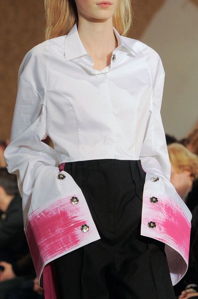
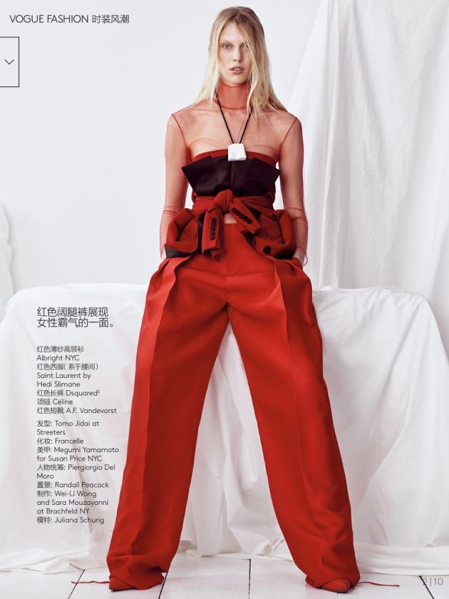
This trip down memory lane + imagery was just the tip of the iceberg for the styling and set direction that went into my most recent photoshoot. With a focus on loose seperates, crisp cottons, wrinkled silks and creating something extraordinary out of the ordinary.
check out more inspirational images and stay tuned for the published piece. ..


